I guess the questions we’re most frequently asked, not so much by clients as by those who come into space are these. How do you put colours together ? Why these – do pink and red really go then ? They ask how we make choices and where we find materials, but mostly what people really want to know is: how do you know it’s going to work ?
It’s so easy isn’t it, to see something someone else has done – a photo in a magazine an advert or a friends home – to fall in love with an idea and to copy it.
Except it isn’t – it’s always much harder than it looks. Anyone who’s ever gone to the shop knowing exactly what they wanted and come out more confused thatn ever can attest to this. It’s also much harder to work for yourself than for a client, because the thought processes that must remain clear and focussed for a client can turn to mush, or at least go fuzzy, when it comes close to home.
Keep a clear head, stand confidently on the research you’ve done and take a sure path. Don’t be afraid of strong colour if that’s what you want, but make sure to balance it well.
The colour wheel shows us the pigments: nature, with all it’s nuance and shading and toning and change of temperature and sound, shows us how.
Take a flower and look at it closely – see how many tones of colour there really are in a ‘solid’ petal. Look at the centre, the stem the leaves – it’s complex. Then look at where it grows, and what with, and you’ll realise just how much we are actually taking in when we look, but how little we really see.
When we come to interpret ‘the look ‘ we are inclined to make our judgements and choices too narrow – to mirror the picture we think we’ve seen, rather than the comprehensive reality.
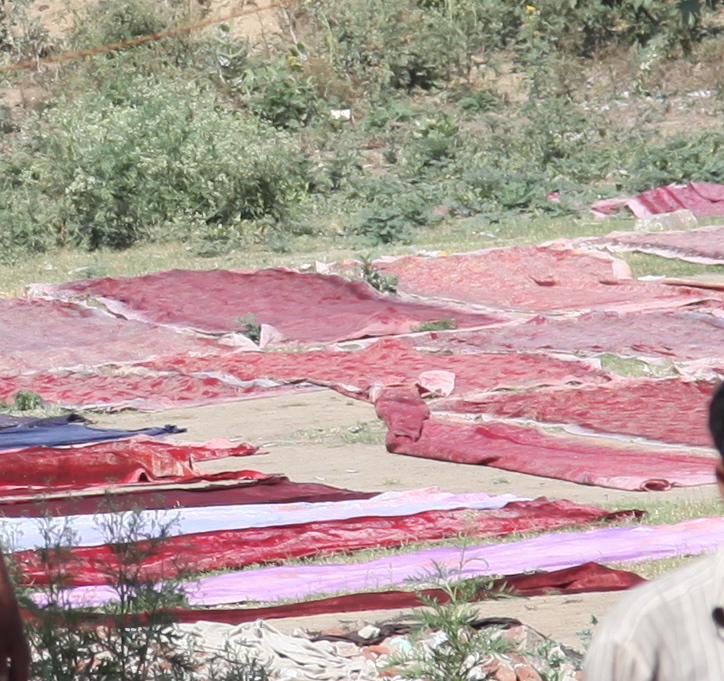
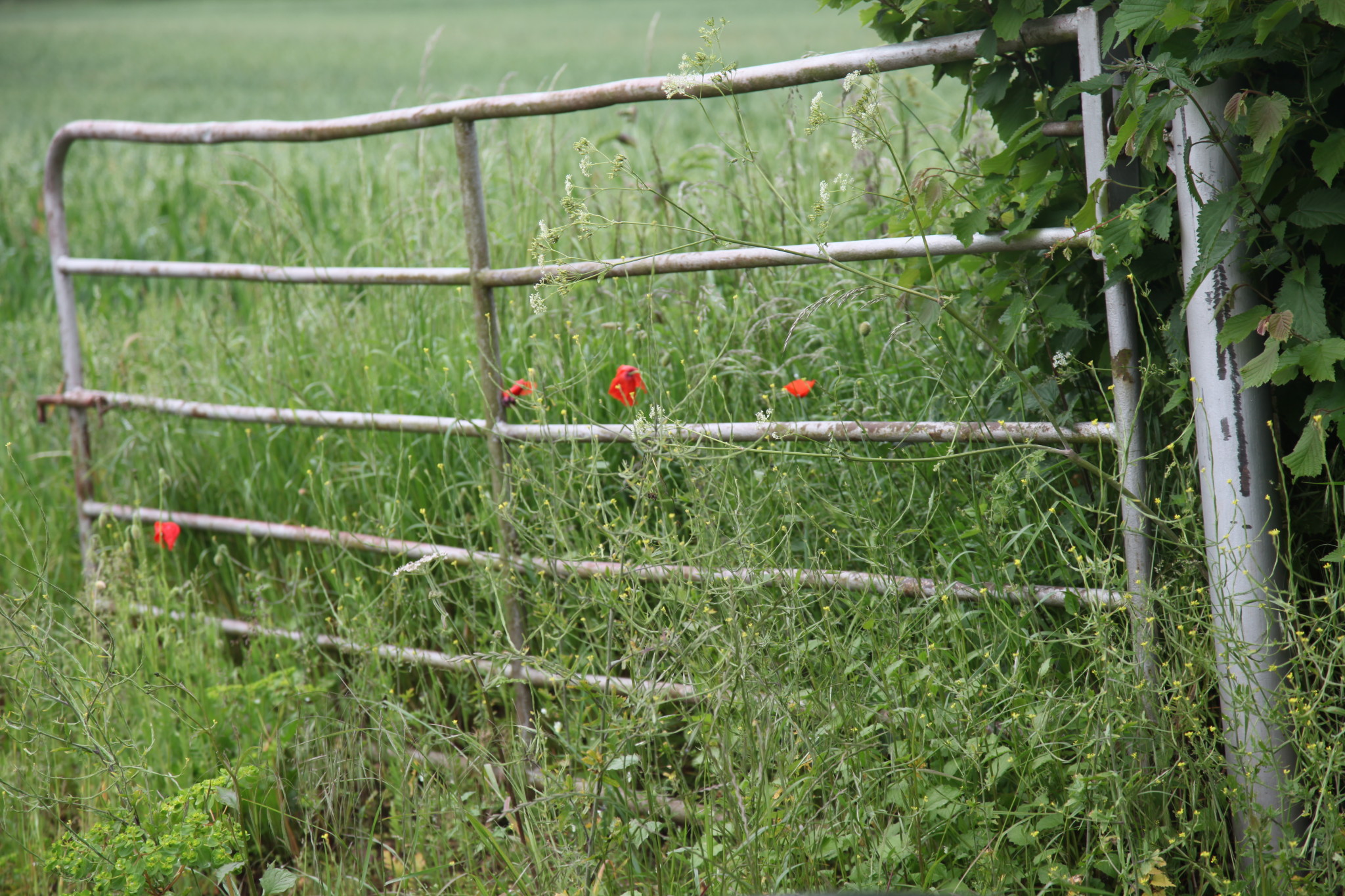
Texture and senses matter – here the example is the field poppy, which is a fighter, but fragile and almost waif – like when compared to the more solid hybrids that we grow in the garden. We also need to consider how we can capture and convey not just the colour, but something of the fragility (or conversely the solidity) of the inspiration we’ve chosen.
Fabrics – the weave and textures – help hugely. The better quality the colouring and the more natural the dyes, the higher the chances are that a textile will contain something of the complexity of the natural world.
This is a small example, but here the walls, the linen blind and the silk sash tie are all tones of a very similar colour – the silk tie is also shot with gold, bringing in a warm and reflective quality. The wooden table, the floorboards, and now the bread are also welcoming and warm in their golden-ness.
With the blue chairs we now have full colour spectrum – red/ yellow / blue, balanced in tone and depth.
And see how the reds and yellows pick up the terracotta roofscapes beyond, how the blue connects to the sky. Colours should move easily from one space to another.
As we look at everyday objects in their place, notice the immediate and further environment, the relationships between them all, the depth and the nuance. By this we are training our eye to better understand hwo colour and th senses will work in our own interior spaces.
None of the images below actually provided the inspiration for this work, but several of them might have done. This room was completed long before these photos were taken, but look at the picture of the room, then the others en masse and see how close they are.

Rolled blinds direct the eye, filter the light and suffuse the room with the colour you’ve used when the sun shines. And if you can reach high enough by hopping up onto a chair or a stool they can be rolled up almost to the top. These were made in two linens with silk ties for some subtle but sure elegance.